In an increasingly datadriven world, computer provide us with an exorbitant amount of data. But endless tables filled with big numbers are just not adequate to humans. Hence we developed visualisation methods to reduce the amount of information we need to process. These visualisations can take any form from simple bar charts to complex dependency diagrams. But most of the visualisations in this world suffer a continuous disease: The belief that a complex visualisation somehow makes the message better, or worse, more professional.
In order to generate appropriate graphs, there are just two simple questions to answer:
1. How much and which information should the visualisation transport? Just as much as
you need to prove your point. Visualisation is used to present main outcomes of
quantitative methods, not all outcomes. Ask yourself what parts of your visualisation are
really necessary. Let me show you two graphs of a companys earnings to profit ratio:
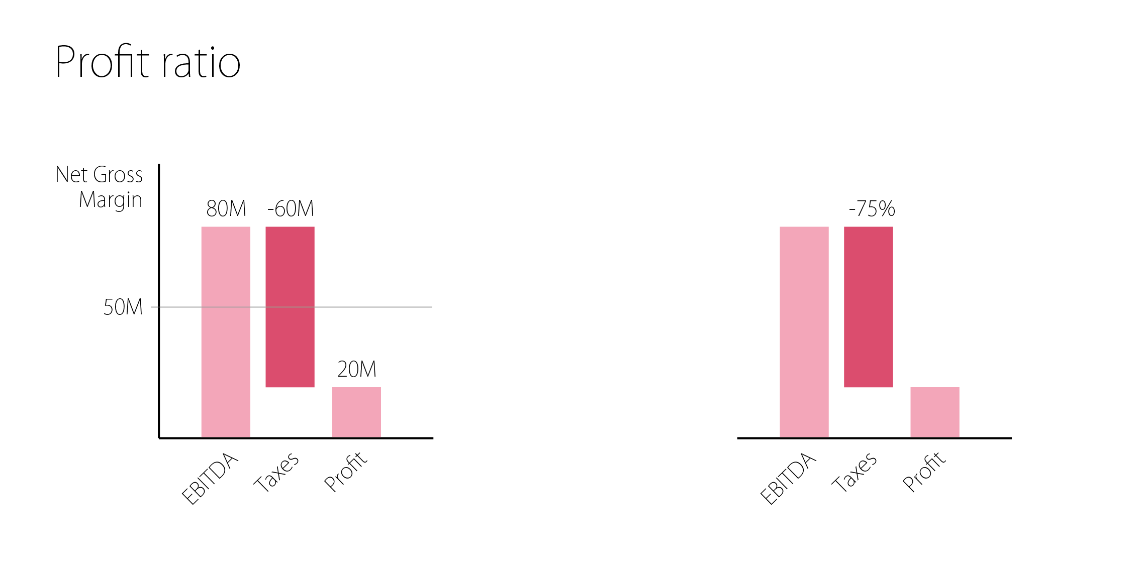
The left one is providing absolute data towards the companys EBITDA, the amount of taxes paid and the remaining profit. The right one on the other hand just shows you that 75% of your earnings are collected by the state. Now think about the purpose of this
visualisation: If the author wanted to point out the earnings of the company, he could have just put the 80 mil down, so obviously he was trying to point out the amount of taxes the company has to pay. The visualisation on the right is equally capable of providing this
message while beeing plain. If someone doubts your research you can always show him a table of your absolute findings. If you’re supposed to include absolute data, try adding a seperate table below the visualisation.
2. What is the purpose of your visualisation?
This question adds up to the decision if the visualisation has to stand for itself. If the visualisation is accompanied by an explanatory text (for instance in a PowerPoint presentation), your visualisation should just replicate the information in the text. It is therefore questionable if your visualisation is in need of any text at all. You can choose to abandon all text and show incredibly beautiful graphs like this one. Dare it.

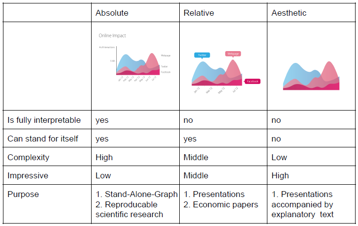
To conclude, there are three main types of visualisations, compared in the table below: